Calculating a mean or a standard deviation is not something done all that often, given that you can only calculate such statistics with interval or ratio level variables and most such variables have too many values to put into a frequency table that will be informative beyond what raw data would look like. But there are times in which this is appropriate and helpful, especially, for example, when one’s professor wants to fit in a question on an exam that has a large enough n to have the power to reach significance, but not enough space on the exam to write out 50 or 100 raw numbers (and what a waste of the precious little time students have to write an exam!).
So, in light of last night’s Liberal minority government win here in Canada last night, here’s why and how one goes about doing this. So, let’s say, you were interested in knowing how the liberals were polling on average over the month of October 2019, so you head on over to the CBC Poll Tracker and pull out the data for every poll listed for this month and discover that in October, Liberals were polling between 28% and 37% over the 61 polls you find. In other words, some polls suggested that 28% of the sample was planning to vote liberal and some polls said 37% of their sample was planning to vote liberal and the other polls had the liberals falling somewhere in between.
One way to calculate the mean and the standard deviation for this would be to just use the raw numbers, which would look something like this:
| 28 | 31 | 31 | 32 | 33 | 35 | 37 |
| 28 | 31 | 32 | 32 | 33 | 35 | |
| 29 | 31 | 32 | 32 | 33 | 35 | |
| 29 | 31 | 32 | 32 | 33 | 35 | |
| 29 | 31 | 32 | 32 | 34 | 35 | |
| 29 | 31 | 32 | 32 | 34 | 35 | |
| 29 | 31 | 32 | 33 | 34 | 36 | |
| 30 | 31 | 32 | 33 | 34 | 36 | |
| 30 | 31 | 32 | 33 | 34 | 36 | |
| 30 | 31 | 32 | 33 | 34 | 37 |
Personally, typing 61 numbers into my calculator feels quite time consuming and ripe for lots of errors. So, one way we could organize these data to make it a bit clearer for the reader would be to put them into a frequency table as such:
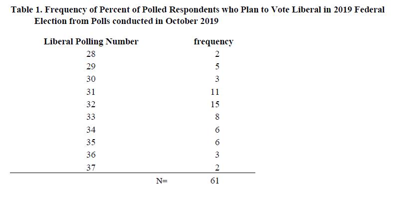
Okay, so now these numbers are looking a bit more manageable, and you could just interpret this table if you wanted, as shown in my other post about frequency tables. You might say something like:
Over the course of October, Liberals were polling with between 28% and 37% in 61 different polls. The modal polling number was 32% of respondents favoring the liberals in 15 polls, although 11 other polls found 31% of respondents favoring the liberals, suggesting a bimodal distribution.
But, let’s say this is the only information given to you and you REALLY want to know want to calculate a mean and a standard deviation for how the Liberals were polling in October, and you want to do this without punching in 61 different numbers, here’s whatcha do:
To calculate a mean from a frequency table:
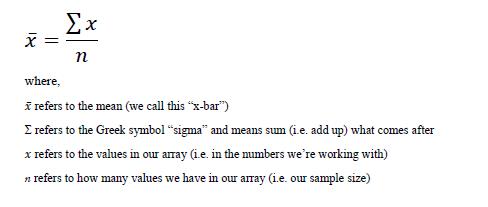
First, how do you calculate a mean with raw numbers? It’s pretty simple, you just add up all of the scores and then divide by the total number of scores you have. This is presented in a more formal way with the following equation:
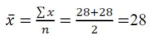
Let’s say that there were only two 28’s in the raw data. Calculating the mean would be simple, as so:
But, in our example, we have 61 values. This will include a lot more addition. We *could* do it like this:
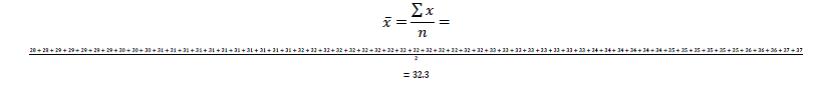
But, I had to make the values so small you can barely see them. Instead of digging through a junk drawer for a magnifying glass, we can just multiply each value by its frequency, since that tiny equation above is the same if we were to write it out like this:
In other words, since there were 2 polls that said 28% of folks support the Liberals, that’s the same as saying 28*2 and then for the 5 polls that said 29% we can multiple 5*29 instead of adding 29 five times. It’s the same thing!
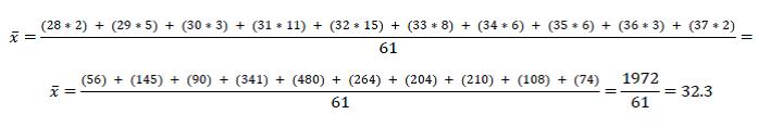
To simply this even more, we can use the set-up of the frequency table to make our work even easier to see as so:
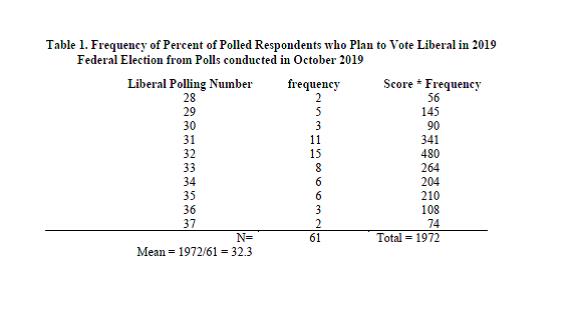
What we’re doing is basically saying is: okay, we’ve got two polls at 28, five polls at 29, 3 polls at 30, and so on. Once we get those values, all we have to do is add them up (this is the sigma-x part) to get a total of 1972, then divide by the number of polls (61) to get a mean polling value of 32.3%.
To interpret this, we can now say:
Among the 61 polls conducted in October 2019 about the 2019 Federal Election in Canada, the Liberals polled at 32.3% on average. In other words, the central tendency of political polls suggested that the liberals would receive around 32% of the popular vote.
(Interestingly, as a side note, in the election, the Liberals actually won with 33.1% of the popular vote. To which, I say “take that!” to those who suggest that the 2016 U.S. election surprise win by Trump despite Clinton’s clear lead in the polls, was due to problems in the data rather than problems in the election…. but again, I digress.)
Also, I should note, that our mean here is a rather crude mean and does not take into account things like size of polls or margins of error. If one were to do that, as do the folks over at FiveThirtyEight, you’d get a slightly different mean of the means that would better predict the outcomes (although, not to beat a dead horse, this too makes me wonder why Nate Silver isn’t using his platform to show that there’s a problem in the US electoral system instead of throwing himself under the bus… but whatever, I haven’t read his book, just a Netflix show about it.
To calculate a standard deviation from a frequency table
Now let’s say that we want to know, not just the central tendency but also the degree of dispersion (i.e. variability or variation among the scores). In other words, were all the polls saying basically the same thing or were they bouncing all over the place? To do this, we need to calculate the standard deviation.
Doing this is very similar to calculating a mean from a frequency table but the tricky part is in knowing when to multiple the scores times the frequency and when to add everything up, because if you don’t do it right, you’ll get a wonky answer. Let’s start with how to calculate a standard deviation in general:
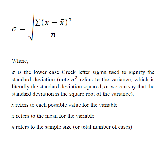
(NOTE! Don’t get mixed up with the lower case “sigma” and the upper case Σ “sigma”! They are pronounced the same way but mean different things.)
Notice that this formula is VERY similar to the formula for the mean, in that we are taking some values and dividing them by the total number of cases. The difference between the two is that for the mean we are figuring out what the average score is, whereas the standard deviation tells us the average distance from each score to the mean. Notice in our equation for we are adding up the distances from the x to the x-bar.
The confusing part is that we have to also square each one. This is because if we didn’t, when we added up all the distances from the mean, we’d get zero because mean is like the fulcrum around which all the scores balance out. For example, if one were to average out the average basketball scores from 2016 for the following eight teams, we’d get an average of 108.8 points per game with five teams clustering pretty close below the mean and only three teams above the mean because the highest scoring team pulls the mean up.

Thus, because some are below and some are above, and the sum of the differences will always add up to zero (or nearly zero with rounding, unless you made a calculation error), we need to square these differences to remove the negative signs to calculate the average distances. The way I suggest doing this is pretty much the same regardless of whether the data are in a frequency table or are raw data, until we get near the end of the steps. So, just like with the mean, let’s use our frequency table to help us keep our calculations in a clear order.
For now, I’m going to shift the frequencies to the right, just to keep them out of the way while we’re calculating our standard deviation, and create columns to help us calculate our squared deviations from the mean as such (also note that I put borders in the table, this is just to make it easier to see. It’s liking changing into old clothes when painting, we don’t present our frequency tables like this publicly, but we might use them like this while working):
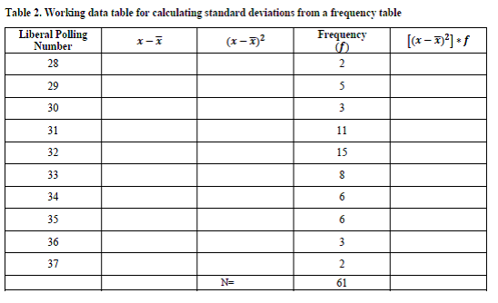
I put that up before adding in numbers to make it clear what data you’ll have been given (the scores and the frequencies of the scores) and what you need to calculate (the deviations from the means, squaring the means), and multiplying the squared means times the frequency. Remember that we already calculated the mean as 32.3. So the steps we’ll take are:
Step 1. Take each possible score and subtract 32.3 from it (e.g. 28-32.3… 29-32.3… 30-32.3… and so on).
Step 2. Square each of these values
Step 3. Multiply them times the frequency (think of this again like with the means, we’re need to add up all the squared deviations from the mean, so by multiplying the two squared deviations from the mean for “28” by 2, it’s like saying: (28-32.3)2 + (28-32.3)2
Step 4. We then need to sum up all the products of the squared deviations times the frequencies
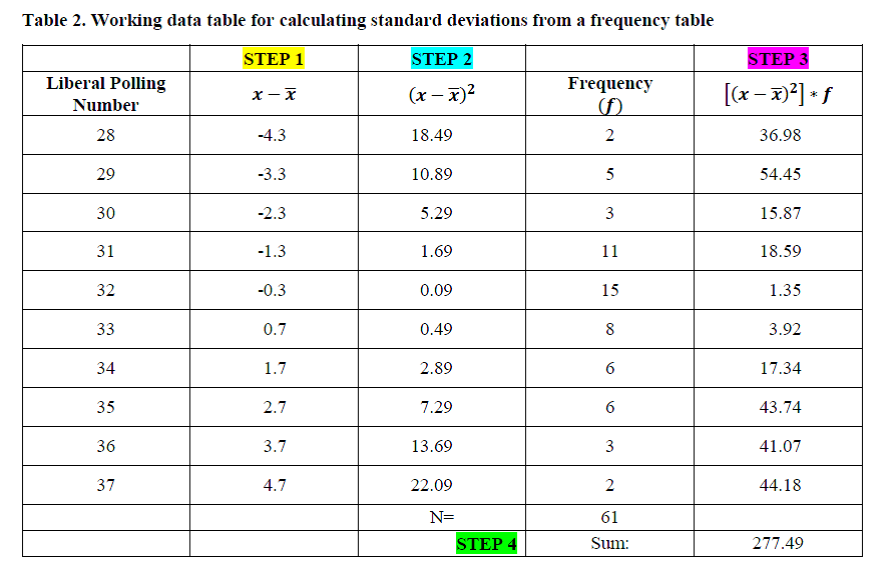
Step 5. To calculate the variance, we then simply take this sum and divide it by the total n (61), to get:
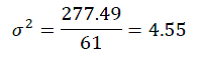
Step 6. To calculate the standard deviation, we just take the square root of the variance:
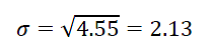
To interpret the standard deviation, we typically discuss it in reference to the mean, so I’ll do so here:
In October 2019, the average Canadian poll indicated that the Liberals would garner 32% of the popular vote in the 2019 federal election, with a standard deviation of 2.13%. In other words, this suggests that the bulk of the polls predicted that the Liberals would take in somewhere around 30% to 34% of the popular vote. As a side note, for funsies, I just calculated the means and the standard deviations for all of the parties included in the polls and found the following results:
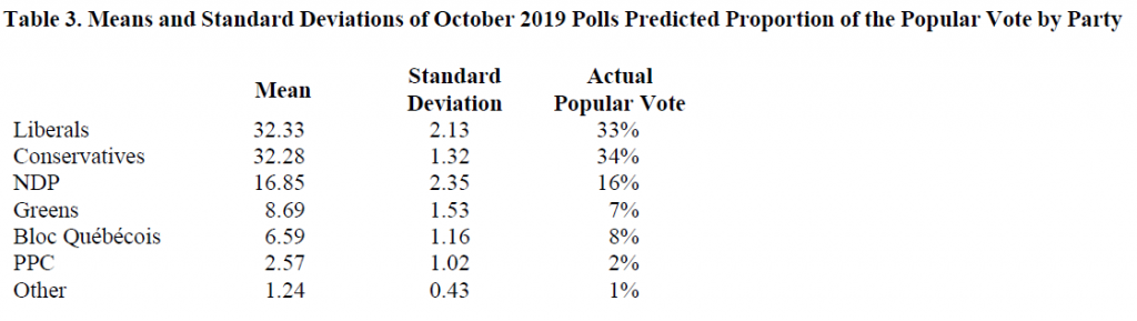
There are a few things I find interesting about these statistics. For one, just how accurate the means of the polls were to the actual popular vote (this is what the Central Limit Theorem teaches us should happen, by the way.). But also, that the standard deviations for the Liberals and NDP (2.13 and 2.35, respectively) were quite a bit bigger than the standard deviations for the other parties (e.g. 1.32 Conservatives, 1.53 Greens, etc.). What this suggests to me, based on my experience and paying attention to the news this past month, is that there was likely a lot more bouncing around between whether people wanted to vote Liberal or NDP. I know for myself and many people I know who lean towards one or the other party, might engage in strategic voting for the other party to ensure that the Conservatives to get into office. One would need to dig into the data a bit deeper to fully make this argument but I would suggest that the data are supporting the argument in the media that Liberals and NDPers were having a harder time making up their minds about who to vote for than did those supporting other parties.
A final interesting analysis of these numbers is that you might notice that in reality more voters picked the Conservatives (34% won the popular vote) compared to the Liberals (33%) who won the election. The explanation is likely that there was high voter turn-out in areas that voted conservative, but fewer seats went to a Conservative. This is how the Canadian system works (for those rusty on their Canadian civics): we vote for a local Member of Parliament and the one in our riding who gets the most votes wins—then the “seats” filled by any particular party are added up and whoever has the most seats gets to have their leader as Prime Minister. We only get to vote for the Prime Minister if that politician happens to represent our riding. I find this offers much food for thought for those interested in electoral reform, particularly if they tend to lean left. This is not to suggest electoral reform is bad (nor good), just that such changes don’t ensure that any particular ideology would end up with a lock on winning.